Run the Geographic Visualisation
Go to Data and go to the tab 'Objects'. Open the Object Type 'Letter' to view the Objects of this Type. Currently there is only one Object available.
The Visualisation buttons are located in the toolbar at the right top corner of the Data section. You run the Geographic Visualisation by clicking this icon.

Visualisations start from the currently selected Object Type (in this case 'Letter') and visualise all the Objects in the Type by default. You limit the selection of Objects that will be included in the visualisation by viewing a single Object or by performing a Filter.
Click the icon to run the Geographic Visualisation. Depending on the resolution of your screen, you will see something like this:
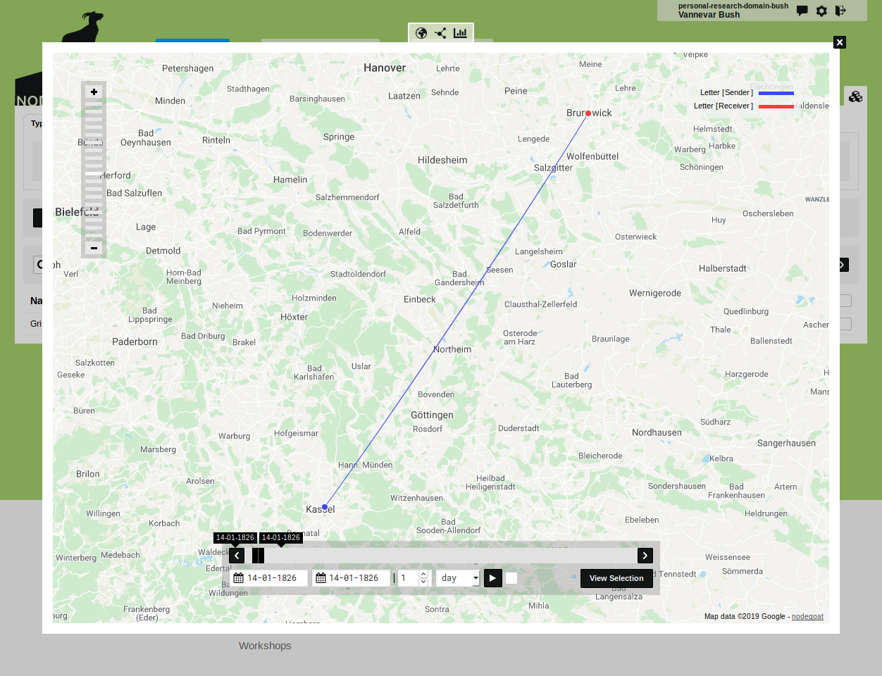
Use the zoom button in the top left corner of the visualisation to zoom in and out (or use your scroll wheel/touchpad).
Use the date slider displayed at the bottom of the visualisation to expand or limit the date selection. By default, the date slider will start with a date selection that covers the complete date range of the visualised data. Grab the date selection to move the selection backward or forward in time.
In the right top corner a legend is displayed with the colours generated per kind of Sub-Object. As defined in the legend: the blue node represents the Sub-Object 'Sender' while the red node represents the Sub-Object 'Receiver'. The elements in the legend are clickable and can be used to toggle the visibility of the nodes.
Hover over a node to display information about this node. Click the node to open a dialog that displays the data behind this node.
The directionality and colour of the line are based on the date first, on the order of the Sub-Objects second. Since the date for both Sub-Objects is the same, the order of the Sub-Objects makes that the line has the same colour as the 'Sender' Sub-Object. Hover and click on the line to display additional information.
Close the visualisation and open the Object Type 'Person'. Run the Geographic Visualisation here by clicking the icon. You see the coloured nodes for the 'Birth', 'Death', and 'Place of Residence' Sub-Objects. Here the directionality and colour of the lines is based on the dates of each Sub-Object.
Please note: the maximum amount of Sub-Objects that can be visualised is 100 000. If you reach this limit, the message 'The current data range is too wide, please narrow your selection.' will be displayed.
The total amount of Sub-Objects of all the Objects in the Type 'City' exceeds the visualisation limit. To visualise a selection of cities: go to the Type 'City' and Enter a 'z' in the quick search bar. Click the icon to visualise all the cities that have a 'z' in their name.