Change the Design of the Visualisations
Go to Data, click on the tab 'Types' and click on the Type 'Letter' and click the icon on the right side of the visualisation buttons. This opens the 'Visualisation Settings' dialog. Go to the fourth tab 'Visual Settings' to change the design of the visualisations. You can change the design of both the Geographic as well as the Social Visualisation.
Most of these options are self-explanatory and we recommend you to experiment with different settings to see what works best for your dataset. One general remark that will be of use when your dataset grows over time: by default the visualisation renders SVG-elements which are good for interaction, but less so for performance. You can change the rendering to pixel so that the visualisation is rendered as an image on a canvas by changing 'Vector (Interact)' to 'Pixel (Performance)' in the 'Settings' section of this dialog.
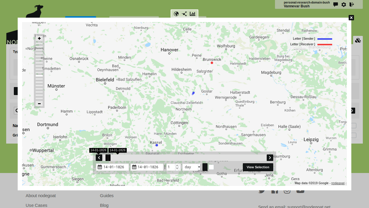
By default sequences of related Sub-Objects are shown as connecting lines in the Geographic Visualisation. If you change 'Connection' to 'Movement' in the 'Settings' section of the Visual settings, these connections will be visualised as moving dots between location nodes.
Change 'Connection' to 'Movement' and click 'Save Visualisation Settings' (set the 'Line Min Width' to 7 to amplify this effect). Now run the Geographic Visualisation to see the single Object of a letter visualised as two nodes with a dot moving from the 'Letter [Sender]' node to the 'Letter [Receiver]' node.